Add Social Buttons to Geekshop product
So, this is a guide that will help you to add a Facebook, Twitter and Pinterest share button for your product.
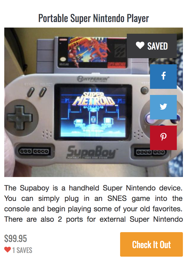
This is how that will end up looking.

Please note that this guide is only for the default theme. But might work for other themes as well. No promises. However let me know if you have issues with any other theme, might be able to help.
So to do this you will first have to open up the product php file located at resources/views/themes/default/includes/product.blade.php.
Now add the following piece of code right after the line number 16 containing <div class="product_link">:
            <a class="facebook_share_btn" target="_blank" href="https://www.facebook.com/sharer/sharer.php?u={{ urlencode($product->purchase_url) }}" data-id="{{ $product->id }}"><i class="geekshop-facebook"></i></a>
            <a class="twitter_share_btn" target="_blank" href="https://twitter.com/home?status={{ urlencode($product->purchase_url) }}" data-id="{{ $product->id }}"><i class="geekshop-twitter"></i></a>
            <a class="pinterest_share_btn" target="_blank" href="https://pinterest.com/pin/create/button/?url=&media=={{ urlencode($product->purchase_url) }}" data-id="{{ $product->id }}"><i class="geekshop-pinterest"></i></a>
Now you have added 3 social icons. Lets see how it looks.

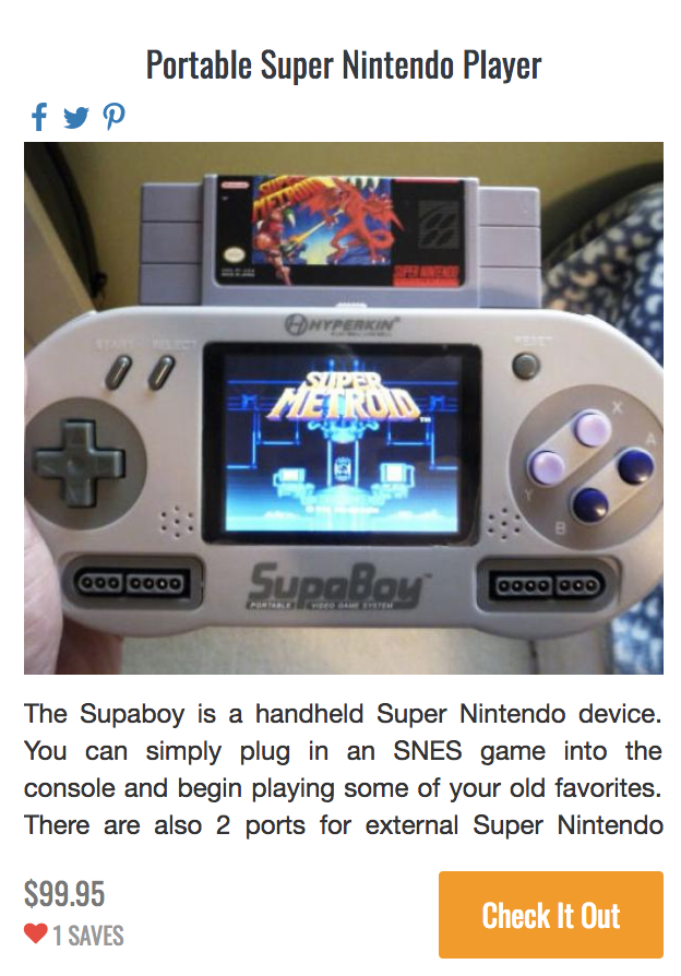
Damn, that looks pretty bad right? Well we can fix that by adding some styles for those new buttons.
To do that open the stylesheet file located at public/assets/default/css/style.css (this is only for the default theme).
In the end of that file add the following piece of code:
.facebook_share_btn,
.twitter_share_btn,
.pinterest_share_btn {
    display: none;
    opacity: 0;
    transition: all .2s ease;
    position: absolute;
    right: 10px;
    top: 60px;
    background: #2274b9;
    padding: 10px 15px;
    color: #fff;
    cursor: pointer;
}

.twitter_share_btn {
    top: 110px;
    background: #4d9ed8;
}

.pinterest_share_btn {
    top: 160px;
    background: #bc0d1e;
}

.product:hover .facebook_share_btn,
.product:hover .twitter_share_btn,
.product:hover .pinterest_share_btn {
    display: block;
    opacity: 1;
    color: white !important;
    text-decoration: none !important;
}
Now lets see how it looks.

Thats not bad, right? You can however modify this as you may want.
Also, just comment for any question.

